 code前端网
源代码:地址
自从我最近开始使用 Vue3 以来,我尝试在“一次学习就放弃”的基础上自己编写 UI 组件示例。我选择的第一件事是多选框组件。
多选框Checkbox 组件是经常使用的组件。我们现在正在逐步改进我们的组件。
开始
首先定义组件
<ani-checkbox>选项</ani-checkbox>
创建组件 Checkbox.vue 文件
<template>
  <label
    class="checkbox-wrap"
  >
    <input
      type="checkbox"
      v-model="model"
    />
    <i class="check-icon">✓</i>
    <slot></slot>
  </label>
</template>
美化Checkbox,主要隐藏input[type=checkbox],然后处理input[type=checkbox]:checked选民
<style lang="less" scoped>
@color: #333;
@activeColor: #409eff;
.checkbox-wrap {
  margin-right: 15px;
  font-size: 14px;
  user-select: none;
  cursor: pointer;
  transition: all 0.3s cubic-bezier(0.645, 0.045, 0.355, 1);
  .check-icon {
    margin-right: 5px;
    font-size: 14px;
    font-style: normal;
    display: inline-block;
    width: 14px;
    height: 14px;
    text-align: center;
    line-height: 14px;
    color: #fff;
    border: 1px solid @color;
    transition: all 0.3s cubic-bezier(0.645, 0.045, 0.355, 1);
  }
  input[type='checkbox'] {
    display: none;
  }
  input[type='checkbox']:checked + .check-icon {
    background-color: @activeColor;
    border-color: @activeColor;
  }
  &.is-checked-text {
    color: @activeColor;
  }
}
</style>
效果如下

逻辑处理
首先定义props
<ani-checkbox v-model="checked" @change="onChange">选项</ani-checkbox>
我们知道,Vue3对于v-model的处理与之前有些不同。 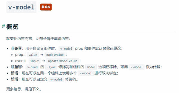
如文档中所述,prop中的value变为modelValue,因此我们组件中定义的props必须更改为
props: {
  modelValue: {
    type: [Boolean, Number, String],
    default: () => undefined
  }
}
我们使用computed来实现双向绑定
  setup(props, { emit }) {
    const model = computed({
      get() {
        return props.modelValue;
      },
      set(val) {
        emit("update:modelValue", val);
      },
    });

    return {
      model
    }
  }
添加事件回调
<input type="checkbox" v-model="model" @change="onChange"/>
这里需要注意的是,事件emit需要在emits
  emits: ['change'],
  setup(props, { emit }) {
		...
    const onChange = () => {
      emit('change', model.value);
    }

    return {
      onChange
    }
  },
这样简单的checkbox组件就完成了。但是我们现在使用的composition-api形状可以封装useCheckbox函数
import { getCurrentInstance } from 'vue';
export function useCheckbox(props) {
  const { proxy } = getCurrentInstance()
  const model = computed({
    get() {
      return props.modelValue;
    },
    set(val) {
      proxy.emit("update:modelValue", val);
    },
  });

  const onChange = () => {
    proxy.emit('change', model.value);
  }

  return {
    model,
    onChange
  }
}
将
引入组件import { useCheckbox } from './useCheckbox';
setup(props) {
return useCheckbox(props);
}
多选组
我们使用许多 UI 库组件。 checkbox 有多种选择。大多数组件库也有这个多选组。接下来,我们将封装一组多选字段。
创建一个新的checkbox-group.vue文件
<template>
  <div class="ani-checkbox-group">
    <slot></slot>
  </div>
</template>
provide/inject 而在实践中我们使用 checkbox-group 来封装 checkbox 组件
<ani-checkbox-group v-model="checkList">
  <ani-checkbox>选项一</ani-checkbox>
  <ani-checkbox>选项二</ani-checkbox>
  <ani-checkbox>选项三</ani-checkbox>
</ani-checkbox-group>
模板文件已经写完了,接下来我们完善逻辑;这里我们使用provide/inject向父组件
export default {
  name: 'AniCheckboxGroup',
  props: {
    modelValue: {
      type: [Array],
      default: () => undefined
    }
  },
  emits: ['change'],
  setup(props, ctx) {
    // 定义事件
    const changeEvent = value => {
      ctx.emit('update:modelValue', value);
      nextTick(() => {
        ctx.emit('change, value);
      });
    };

    const modelValue = computed({
      get() {
        return props.modelValue;
      },
      set(val) {
        changeEvent(val);
      }
    });

    // 向子组件传递
    provide('CheckboxGroup', {
      name: 'CheckboxGroup',
      modelValue,
      ...toRefs(props),
      changeEvent
    });
  }
}
子文件夹 inject 接受
// 接收父组件消息
export const useCheckboxGroup = () => {
  // 这里的名称对应 provide 名称
  const checkboxGroup = inject('CheckboxGroup', {});
  // 判断是否为多选框组
  const isGroup = computed(
    () => checkboxGroup && checkboxGroup.name === 'CheckboxGroup'
  );

  return {
    isGroup,
    checkboxGroup
  };
};
useCheckbox中,需要评估是否是多重选择的一组。具体思路看评论吧?其实逻辑很简单~
export const useCheckbox = props => {
  const { emit } = getCurrentInstance();

  const { isGroup, checkboxGroup } = useCheckboxGroup();

  // 存在多选组,则使用多选组 modelValue
  const store = computed(() =>
    checkboxGroup ? checkboxGroup.modelValue.value : props.modelValue
  );

  // 还是判断多选组
  const model = computed({
    get() {
      return isGroup.value ? store.value : props.modelValue;
    },
    set(val) {
      if (isGroup.value && Array.isArray(val)) {
        checkboxGroup.changeEvent(val);
      } else {
        emit('update:modelValue', val);
      }
    }
  });

  // 判断多选框是否选中
  const isChecked = computed(() => {
    const value = model.value;
    if (isPropType(value, 'boolean')) {
      return value;
    } else if (isPropType(value, 'array')) {
      return value.includes(props.label);
    }
    return null;
  });

  const onChange = e => {
    const target = e.target;
    const value = target.checked ? true : false;
    emit('change', value, e);
  };

  return {
    model,
    isChecked,
    onChange
  };
};
这里需要修改模板,需要输入选中选项的字段value以及是否勾选了多选框checked
  <label
    class="checkbox-wrap"
  >
    <input
      type="checkbox"
      v-model="model"
      :value="label"
      :checked="isChecked"
      @change="onChange"
    />
    <i class="check-icon">✓</i>
    <slot></slot>
  </label>
获取结果
总结
还是得自己封装一下。组件中的一些细节和想法仍然可以激发业务逻辑。