 code前端网
基于ChoiceChip的标签选择控件的Flutter开发演练
1.ChoiceChip
ChoiceChip选择控件可以实现单选效果
先查看对应的属性
 const ChoiceChip({
    Key key,
    this.avatar, //左侧Widget 一般小图标
    @required this.label, //标签文字
    this.labelStyle, //标签文字的样式
    this.labelPadding,
    this.onSelected,
    this.pressElevation,
    @required this.selected, //是否选中
    this.selectedColor, //选择的颜色
    this.disabledColor, //不可用的颜色
    this.tooltip,
    this.shape, //shape 默认是两端半圆形
    this.clipBehavior = Clip.none,
    this.backgroundColor, //背景色
    this.padding,
     //设置为MaterialTapTargetSize.shrinkWrap时
     //,clip距顶部距离为0;设置为MaterialTapTarget
     //Size.padded时距顶部有一个距离
    this.materialTapTargetSize,
    this.elevation,
    this.shadowColor,//阴影背景色
    this.selectedShadowColor,//选中的阴影背景色
    this.avatarBorder = const CircleBorder(),
  })
复制代码
默认情况下,ChoiceChip选择主要是改变背景颜色相应的文字,
2。封装代码
MultiNormalSelectChip 封装ChoiceChip 完成标签选择 ChoiceChip 可以完成标签选择。然后通过调用Selected函数设置对应的选中元素,并将其存储到SelectList中。效果如下: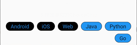
3。改变原来的ChoiceChip
然而,公司UI的形象真的变成了这样。在这种情况下,必须进行更改。 ChoiceChip源码中,添加selectShape属性
BorderChoiceChip(
          label: Text(
            item.getTag(),
            style: TextStyle(fontSize: 14),
          ),
          selected: selectList.contains(item),
          materialTapTargetSize: MaterialTapTargetSize.padded,
          labelPadding: EdgeInsets.only(bottom: 9),
          padding: EdgeInsets.only(left: 12, right: 12, bottom: 9),
          selectedColor: Colors.white,
          backgroundColor: Colors.white,
          //修改边框样式
          selectShape: RoundedRectangleBorder(
            borderRadius: BorderRadius.circular(12),
            side: BorderSide(color: Colors.blue, width: 0.5),
          ),
          shape: RoundedRectangleBorder(
            borderRadius: BorderRadius.circular(12),
            side: BorderSide(color: Colors.black, width: 0.5),
          ),
          onSelected: (selected) {
            setState(() {
              selectList.contains(item)
                  ? selectList.remove(item)
                  : selectList.add(item);
              widget.onSelectionChanged(selectList);
            });
          },
复制代码
,这样就可以实现相应的需求。效果如下。如需商业转载,请联系作者授权。非商业转载请来源。
版权声明
本文仅代表作者观点,不代表Code前端网立场。
本文系作者Code前端网发表,如需转载,请注明页面地址。
相关文章


作者文章
- 用小程序学英语到底有没有用?适合哪些人?避坑指南加靠谱用法有吗? 3周前 (05-22)
- 2024-2025做通用和本地生活小程序没人看没人下单怎么办?试试这6个小成本留客转化型技巧 3周前 (05-22)
- 做小程序英文翻译避不开哪些坑?怎么翻才能吸引海外用户留存? 3周前 (05-21)
- Vue3 Composition API watch开启deep后踩过哪些坑?如何高效用它处理深层数据监听? 3周前 (05-19)
- Vue3中watch监听props时,deep:true到底该不该随便开? 3周前 (05-19)